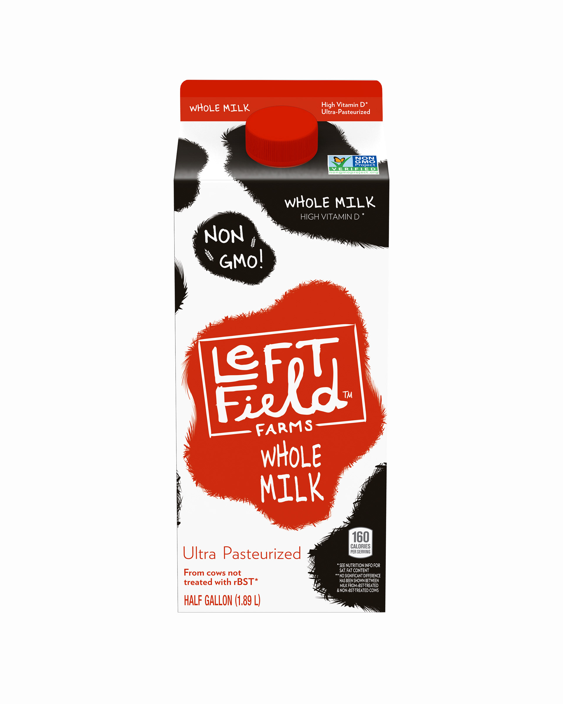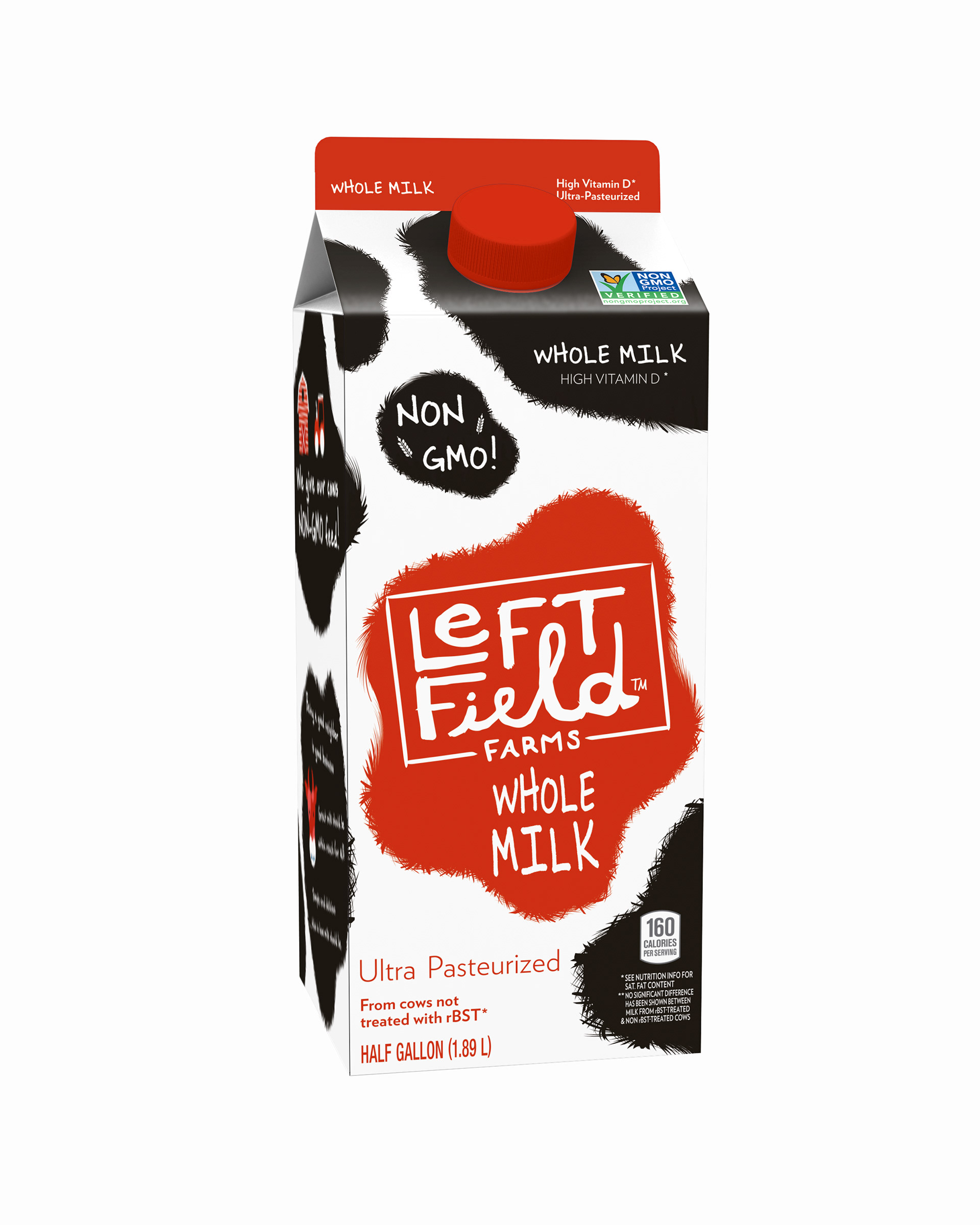

Objective
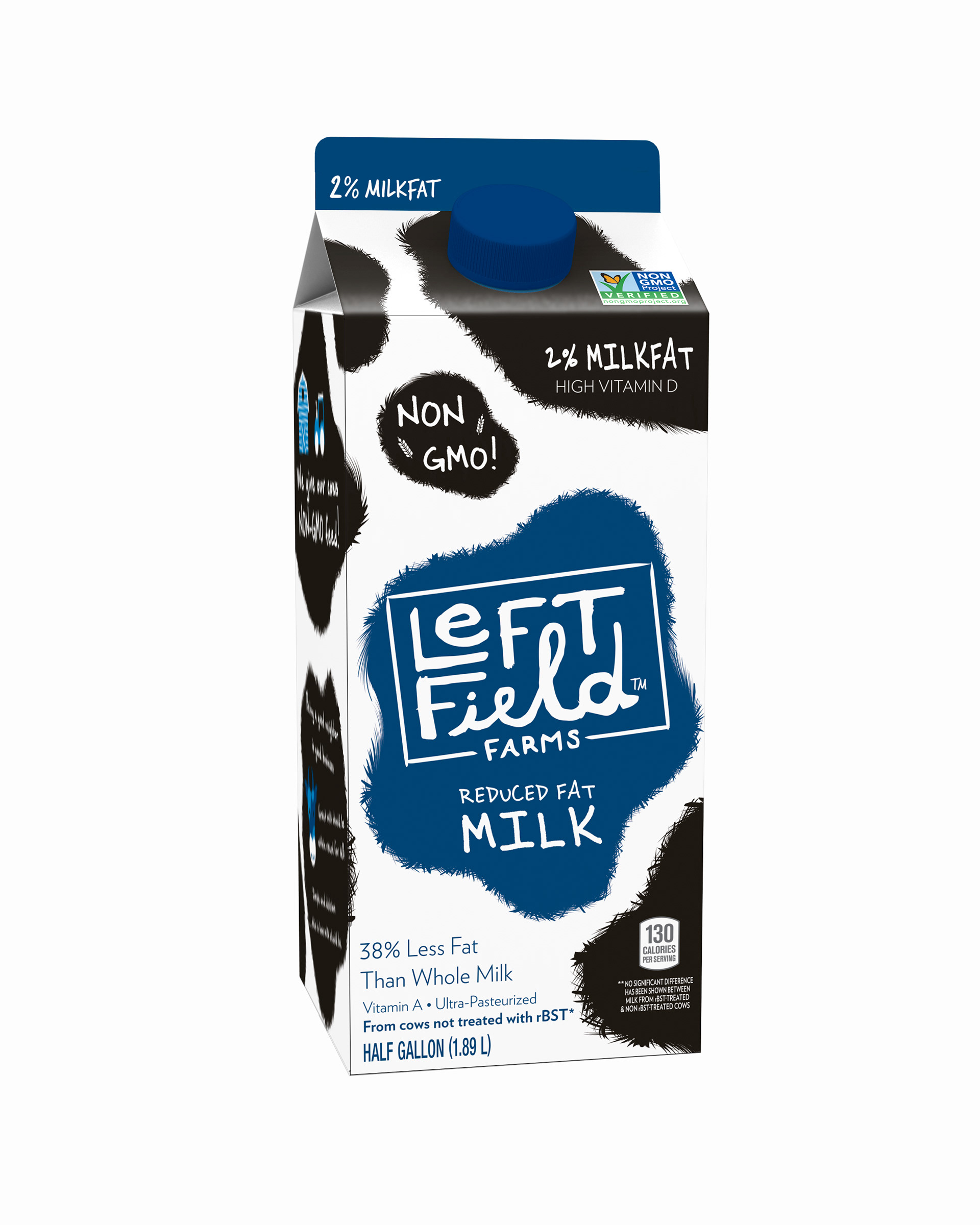
Using the template from a past project, my task was to redesign a carton of milk to include the new direction of the client. In this case the client wanted to address how important the NON-GMO was in their branding. Making sure to create a shelf presence that stood out against the competition.
Process
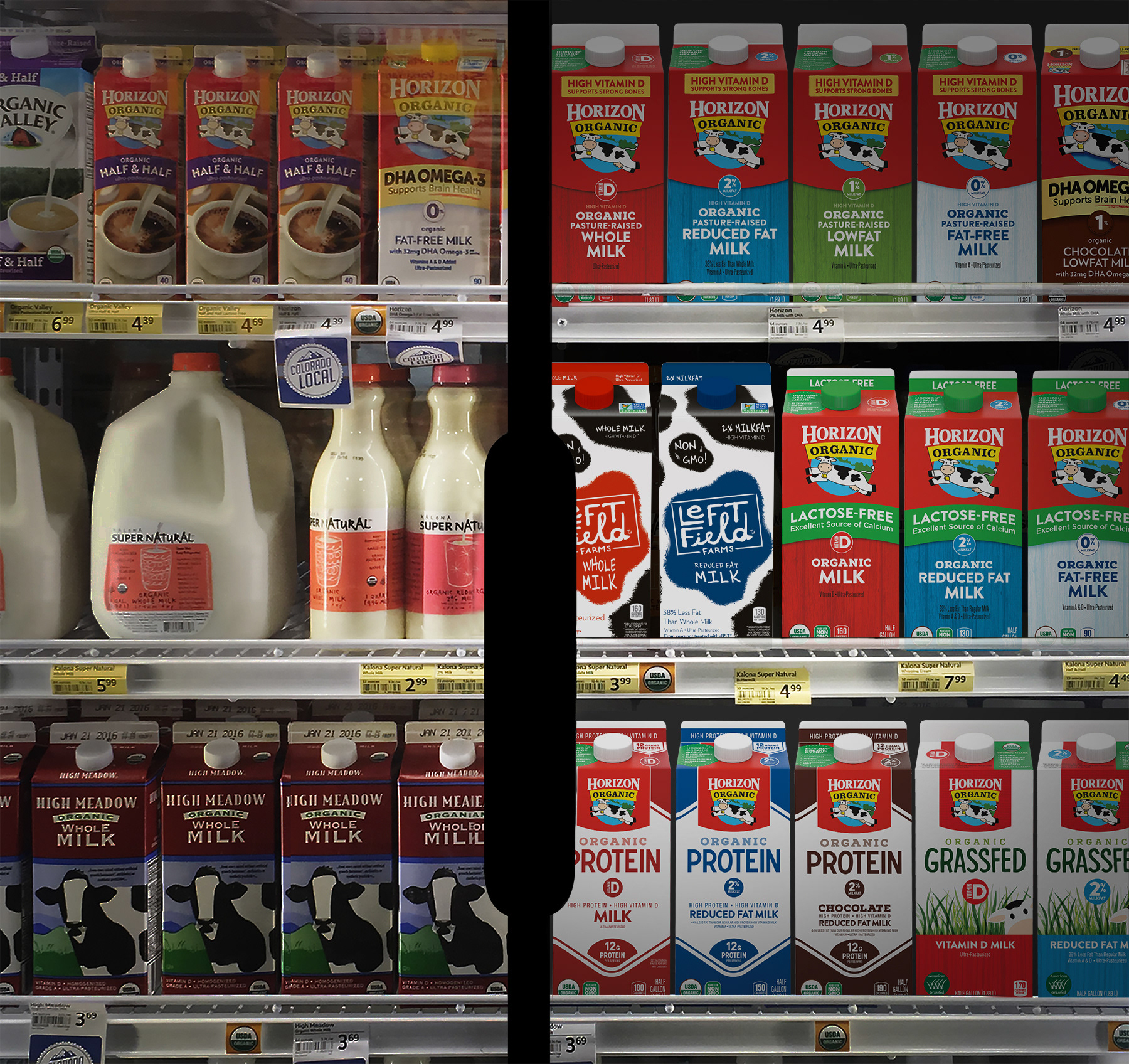
To understand the shelf presence, I took imagery of local grocery store shelves to analyze what stood out the most and why, what similar aesthetics blended in and which elements needed to be emphasized.
I created a design that acted on these elements going through several sketching and proof of concept phases before reaching semi-final comps. I received one round of final feedback from the client before modifying the design to address all the feedback and wants of the client.
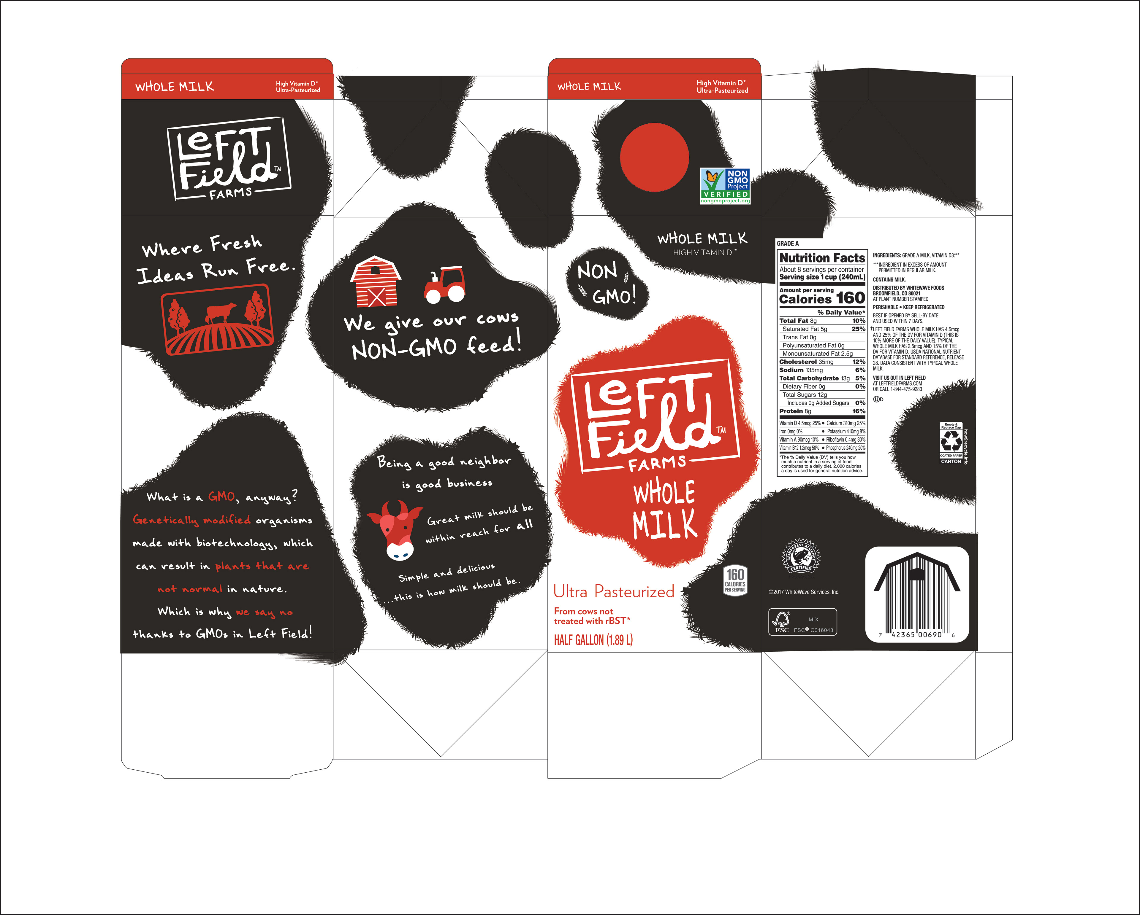
Approach
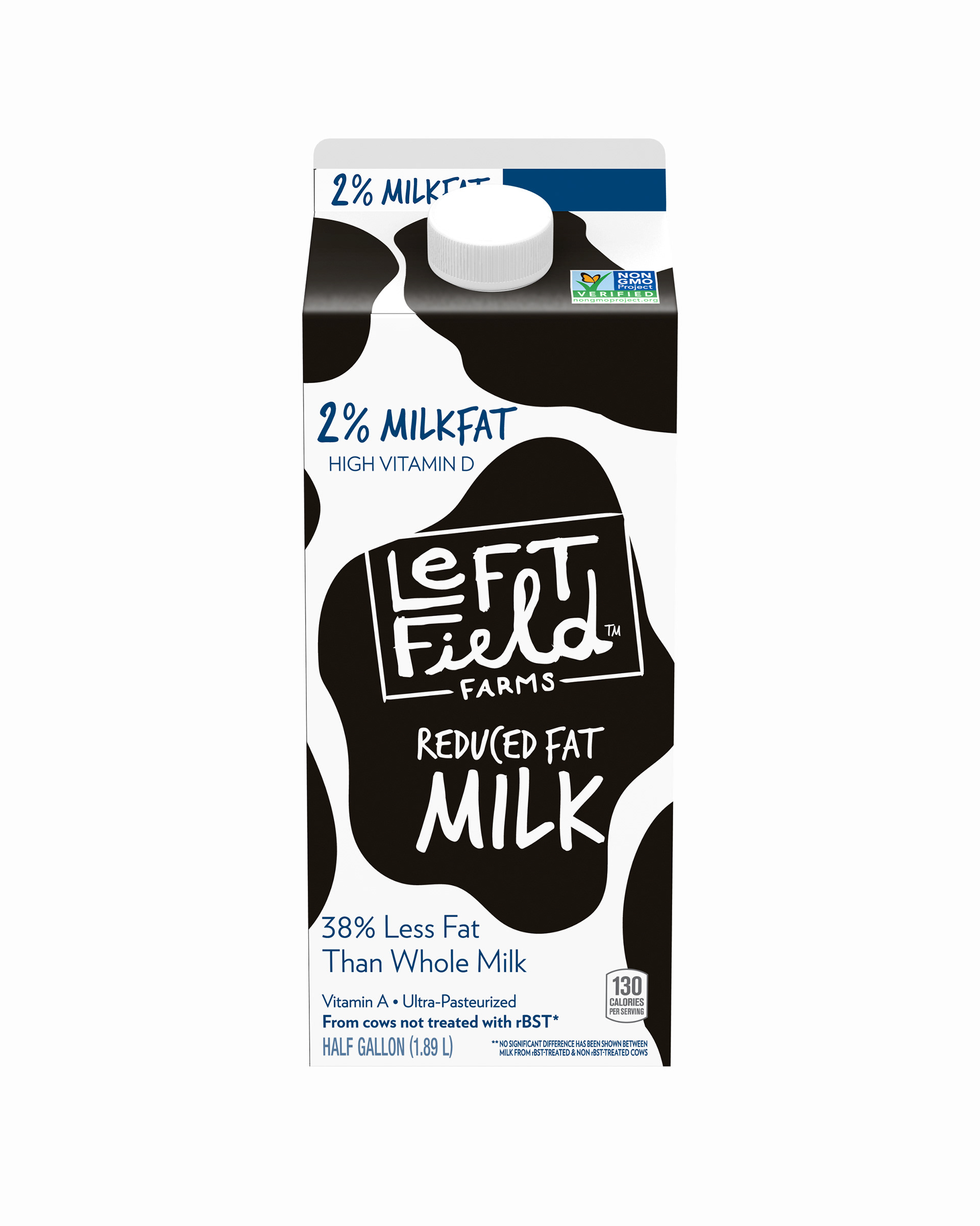
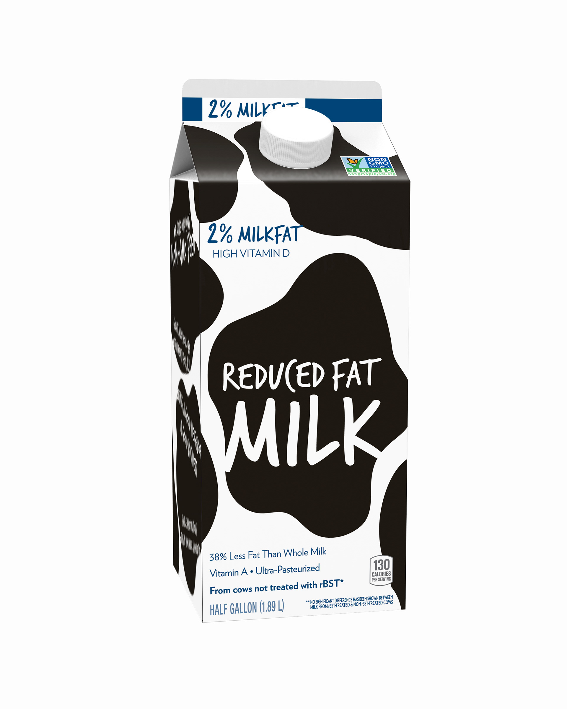
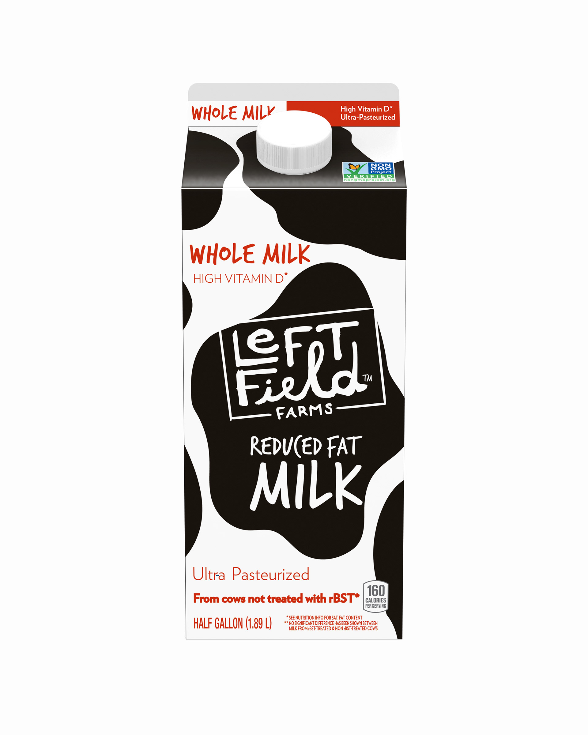
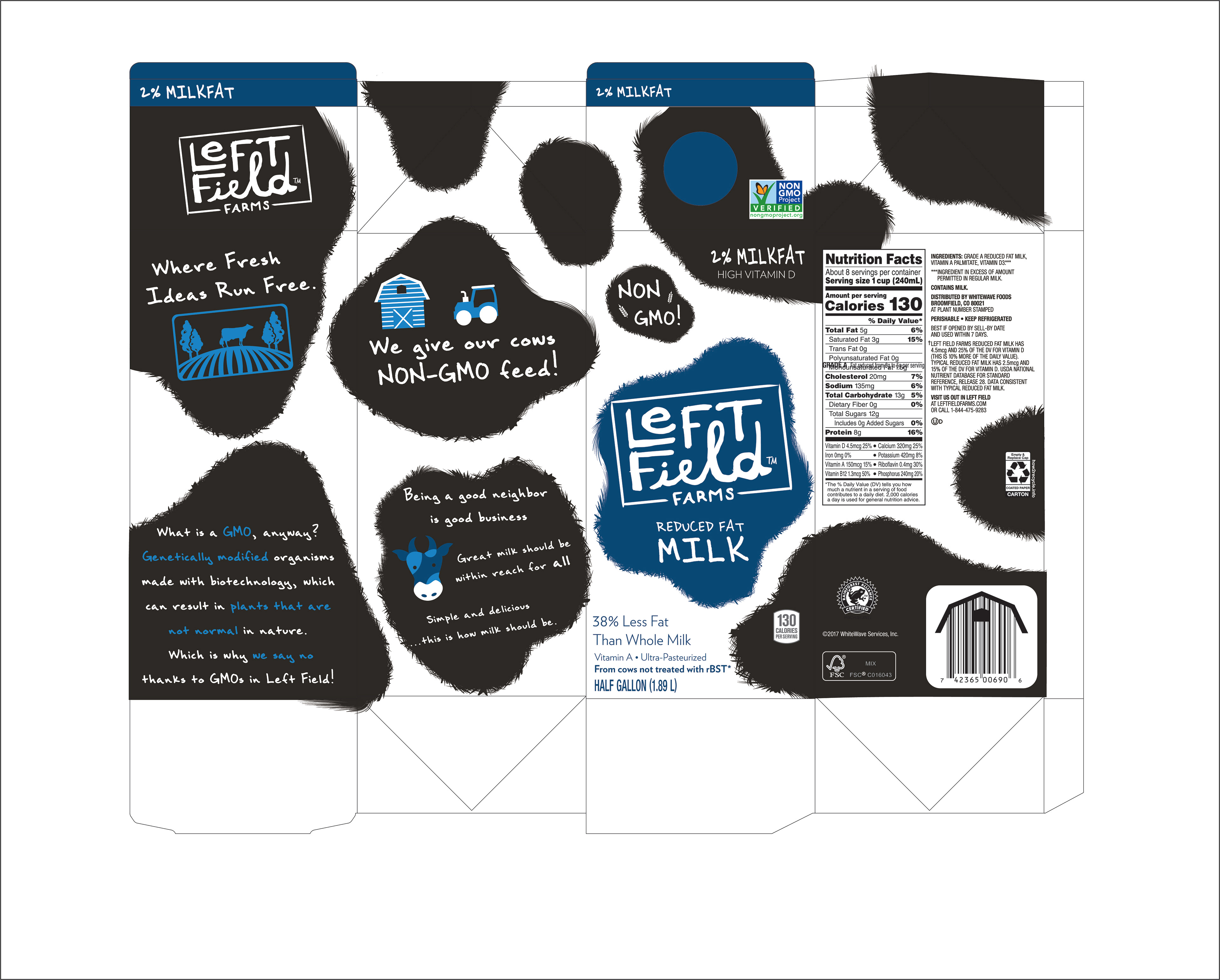
Learning to distinguish design hierarchal priorities was integral to this project as there are distinct coloring codes used for milk percentages; that is what consumers use to quickly identify a product. In the case of this project, making sure the design didn’t clash with the colors was very important.
I used the large cow-like spots to grab the attention of both adults and kids. The typography was chosen to help create a casual and fun aesthetic in the brand. I used free space on the sides to explain and inform the audience to the important message of NON-GMO that the client wanted.